Client
One of us
Date
2020
Intro
One of us is a football related talent-game that run its first season in 2019 and has been very successful.
The goal of the talent is to offer a chance to become a football player in a Serie A team.
The selections take place in an unconventional way: through participation to online challenges, the vote of the public and the selection (only at the end of the season) by a talent scout of the most talented player.
For this client I worked on the design of the app, registration and participation flows and co-designed the website together with one of my colleagues.
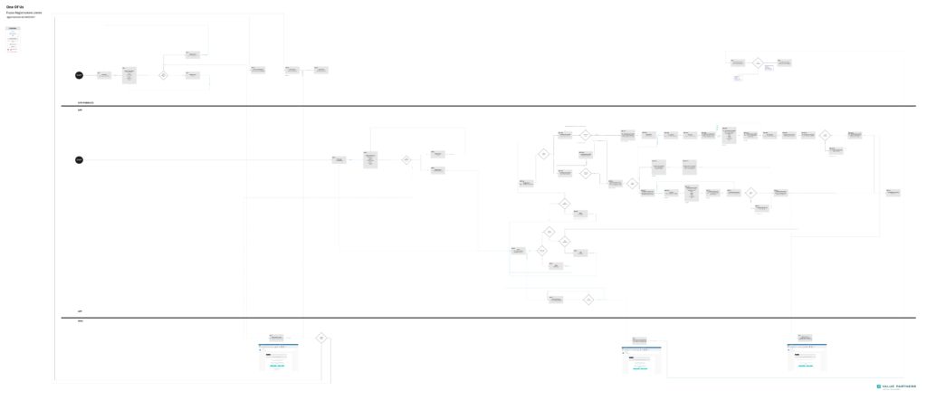
The work started from the business requirements defined by the Business Innovation unit of Value Partners Digital technology and from the collection of client requirements.
Together with the stakeholders, we mapped the architecture of the already developed touchpoints and worked to redefine the order, presence and position of the contents in all the new ones.
This work led to the definition of the new website structure but above all to the complete redesign of the app architecture.
Navigation pattern
To guarantee an easy and intuitive navigation we chose to use the “tab bar” pattern.
This pattern make it possible to highlight the most important sections of the app and to have them constantly available near the user’s thumb.
Registration
Anyone over the age of 16 can sing up, and the registration flow allows the user to choose which type of profile they want to create to participate in the app.
As One of us is not just a tournament, but a football-related content platform, it is possible for users to register as Spectators (non-participants) or, if they wish, create a participant profile.
It is also possible, by paying a fee, to create a “Pro” profile, which allows the user to have some advantages during certain phases and to purchase, directly, the possibility of participating in the subsequent phases of the tournament.
We decided to offer the same flow for every channel so that the user could choose which channel to register from without constraints and enjoy the same satisfactory experience in any case.
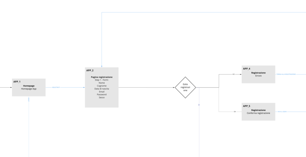
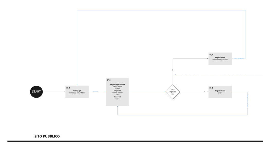
We have chosen to limit the data required during registration to a minimum, so as not to limit user access to the platform.
After sharing and evaluating the flows, we moved on to designing interactive wireframes that allowed us to visualize the contents of the pages as well as to make beta-user-tests with the work group to verify the choices we made.
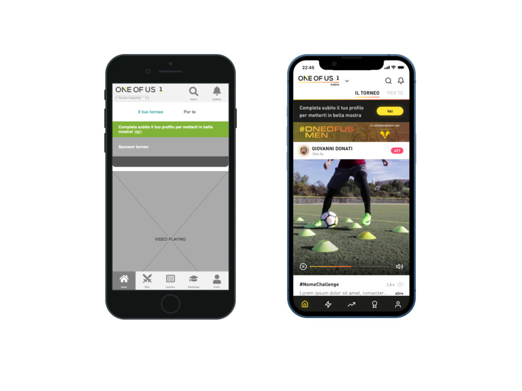
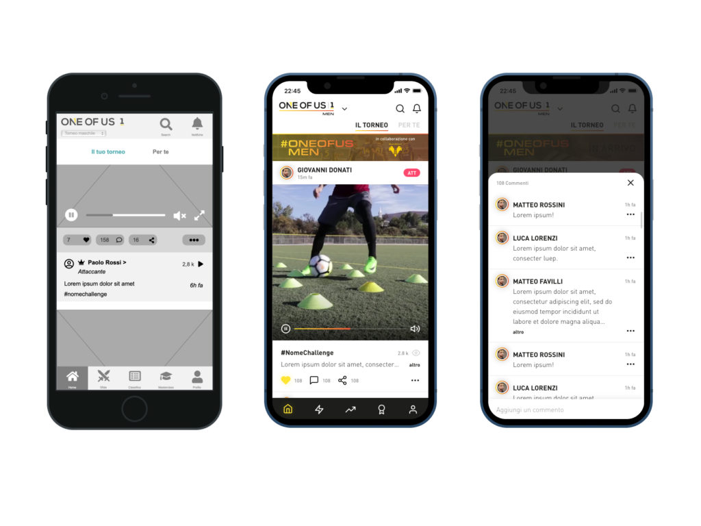
Feed
One of us is a talent game: users can upload videos to partecipate to challenges proposed by the platform and, based on shares, likes, or even the evaluation of professional scouts, earn points that will make them rise in the rankings. .
The feed shows all the videos uploaded by users, in the different challenges, and allows a user to always have new content available.
In the feed it is possible to view the videos of the users (and of the different tournaments, male and female), like, comment and share them.
As for the way to present the content, we have chosen to offer an experience similar to the one seen on other social networks (Instagram, TikTok) since the user target we identified is the same target as these platforms.
In this way, the user does not have to learn new patterns to navigate the app, and feels completely at ease from the first use.
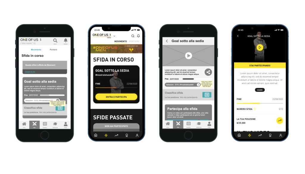
Sfide
The Sfide (challenges) tab shows the ongoing challenges and gives users the opportunity to participate by uploading their own video.
In the challenge page, is possible to see all the uploaded videos relating to the challenge and manage the video uploaded.
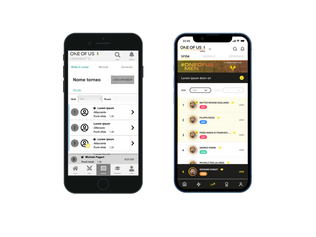
Leaderboard
The leaderboard section shows the tournament leaderboard and the user’s position.
We have chosen to use a “Sticky” component at the bottom of the page to allow the user to always have visibility of her position, even if she is in a low position in the ranking.
By tapping on the component, the user is taken to his position in the ranking.
Users are identified by different badges in relation to the achievements they have unlocked (or the bonuses they have purchased) and their position in the ranking.
Masterclass
The “masterclass” section allows users to purchase and use the masterclasses offered by one of us.
Profile
In the profile page, users can see their profile and manage their information.
The user card is the identity card with which the user introduces himself to the public and to the scouts.
In this section it is possible to see his physical and professional characteristics.
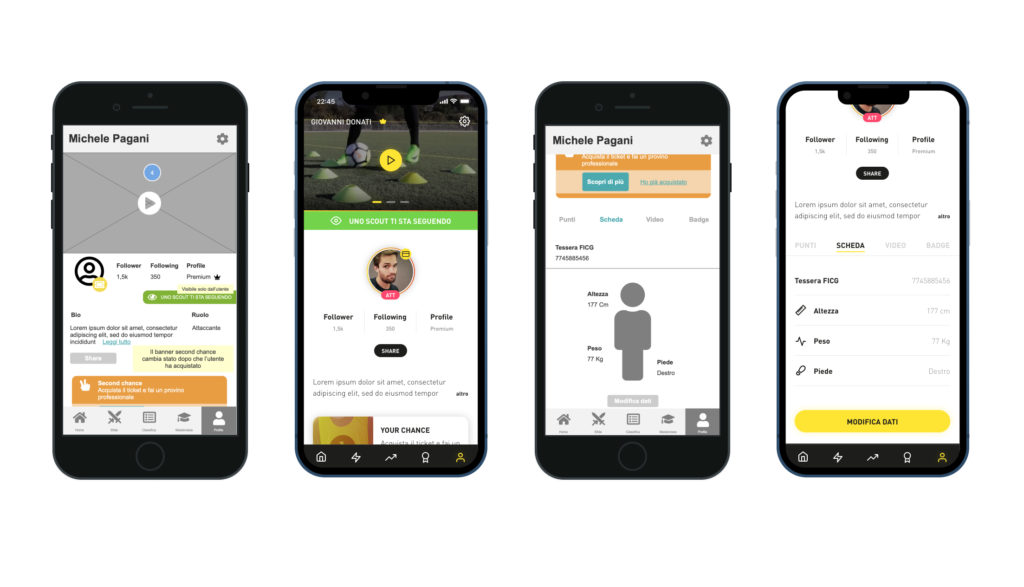
Pass
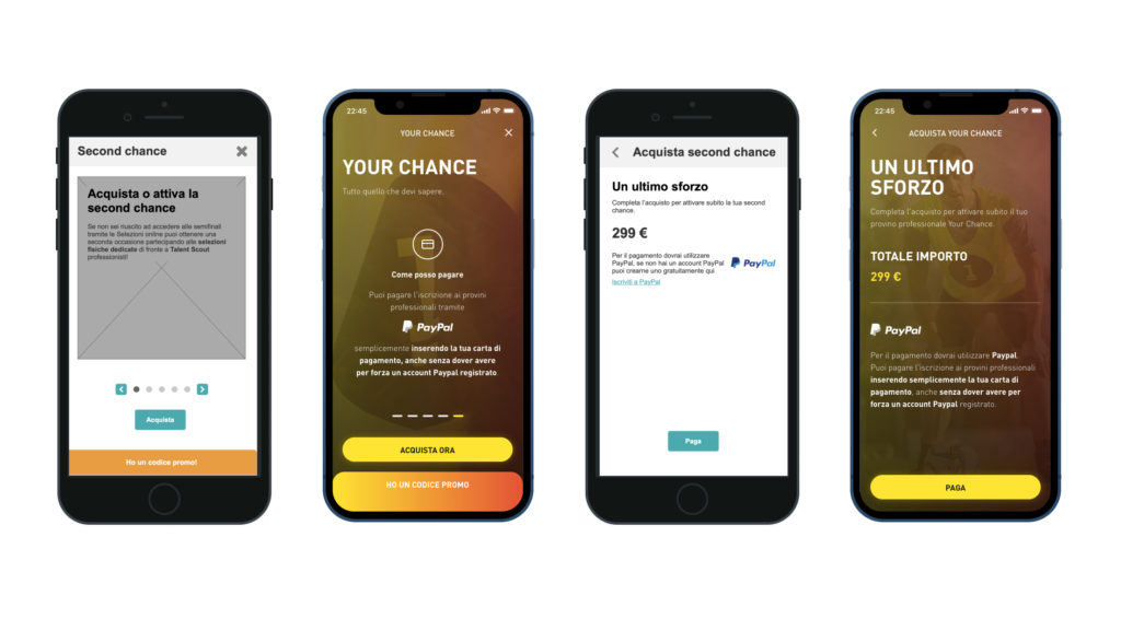
During the experience, the users has the opportunity to upgrade their profile or purchase special passes that allow them to access next stages of the talent.
The management of these upgrade flows has been designed to take place within modal windows, so that they can be reached from any section of the app and easily closed in case of need.
User test
After the initial wireframe design, the UI unit declined the different screens based on the UI concept proposed during the initial phase of the project.
Starting from these screens, we carried out some in-house user tests (for budget reasons) to validate the goodness of the design and the clarity of the navigation.
Delivery and next steps
After the initial design phase and after having improved the product with the help of the feedback received from the user tests, the work continued with the design of all the remaining pages and the sharing towards development.
During the following months the app was constantly maintained and modified according to customer needs (collected from comments on communities and stores) and the business requirements.
Deliverable
Content architecture, User flow, Wireframe, Digital prototype
Software
Axure, Miro