Client
UnipolSai
Date
2020 – 2021
Intro
Together with the marketing and the digital touchpoint team I worked on the complete redesign of the UnipolSai App.
We started by define what was not working for the user in the old version.
By observing the users and analyzing the evidences provided by the digital support team we found out that the main problem was the scattering of informations and the consequent difficulty to find the section containing the informations needed.
Information architecture
We started by mapping the old information architecture to be able to visualize and analyze it.
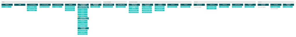
As it is possible to see, with the passage of time and the growth of UnipolSai’s offer, the information architecture has grown and branched out, giving life to an ever-increasing number of sections that had the same weight in the navigation.
Starting from there, we worked on grouping the different sections into logical containers, so that it was easier to the user to identify in which section he could find the information he needs.
Navigation pattern
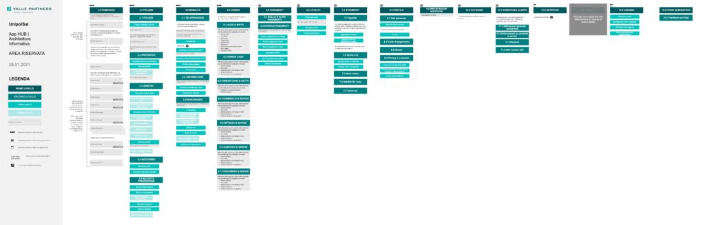
In order to improve the experience, we identified a new navigation pattern.
The old method of navigation was the “hamburger menu”, but that led to a big issue: all the sections had the same weight in navigation and the user was faced with a wall of choices.
We worked on the definition of a new pattern, and, after a benchmark and a comparison beteween the pros and cons of different navigation patterns, we found out that the best one both for the users and the business needs was the Tab-bar menu combined with an hamburger menu.
In that way the user is presented a limited number of options (relieving his cognitive load in identifying witch is the main section of the App) and the Business have the freedom to “push” a specific section when needed.
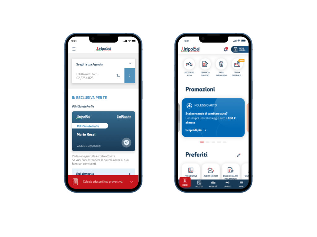
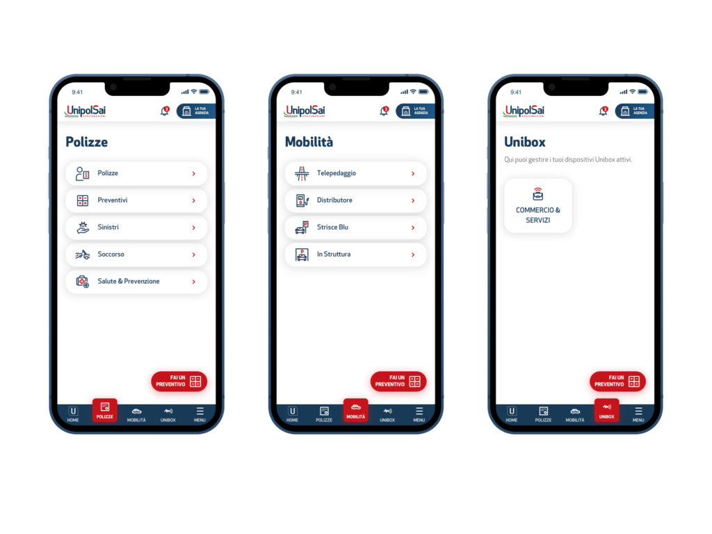
Homepage
The main tab is the homepage tab, where the user can see a “Dashboard” containing all his important data in one place.
From there the user can see if there are any policies expiring, if there are whether alert, can see all his vehicles, and much more
Widgets
We have designed widgets to allow the user to access the most important information directly from the homepage.
These widgets, designed as cards, can be reorganized by the user through a drag and drop system so that the homepage is customizable and always suited to the user’s needs.
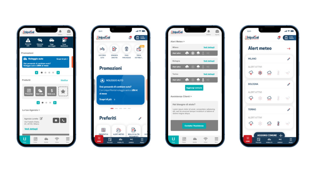
Some widgets, then, have been identified as “live”.
These widgets appear on the customer’s homepage only if there is a “live” event in progress (expiry of a policy, the payment of a parking space, a notice from the calendar) and are positioned at the top of the page, so as to always be in evidence.
If the user wants to have his dashboard even more personalized, he then can rearrange his widgets by using the customization tool at the bottom of the page.
Other sections
The other sections in the tab bar are the “Policies” section, which allows the user to access all the informations related to their insurance with UnipolSai, manage claims, and request assistance if necessary, the “Mobility” section , which allows the user to carry out all actions relating to the payment of mobility services (refueling and parking) and the “Unibox” section, part of the UnipolSai offer that allows the user to remotely control all the “Boxes” “purchased and installed in the different properties.
User testing
We created a wireframe prototype to validate our assumptions with the business, then we carried out tests on users to verify the goodness of the choices made.
The UI Unit designed the necessary pages to create an Invision prototype and in the meantime the Service Design Unit worked on identifying the target users to carry out the tests.
Users were asked to navigate the app and were asked to perform some common actions in the different sections.
With this test we verified that the navigation was clear and that reaching the most important sections (important both for the users and for the business) was simple and immediate.
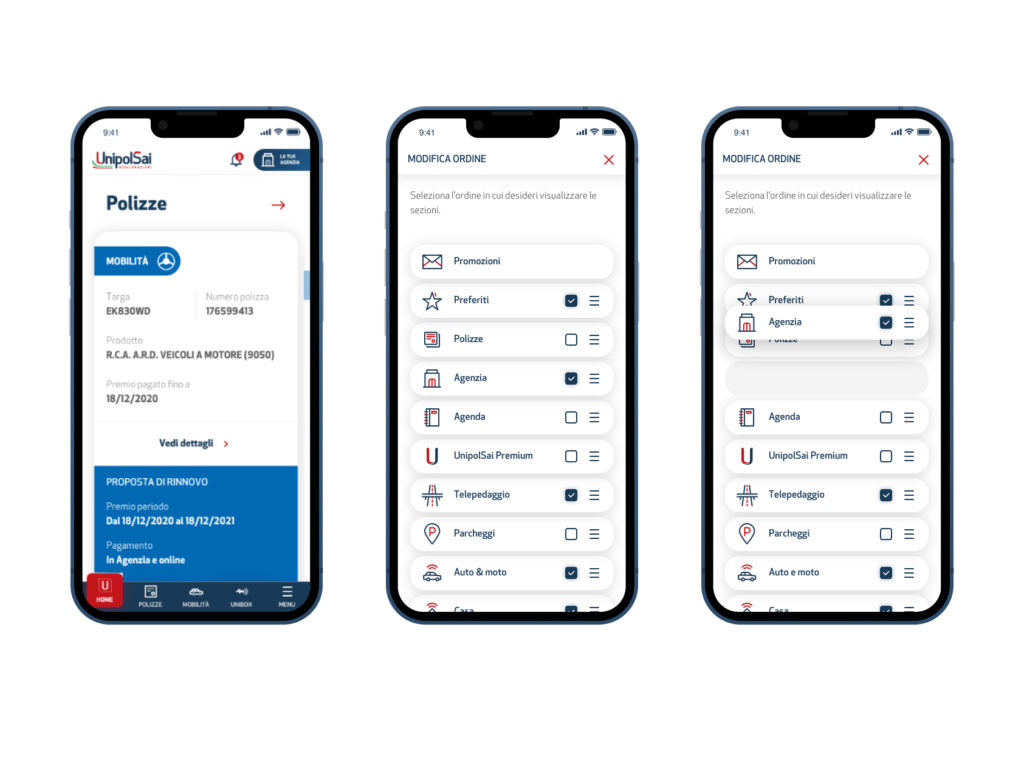
The results of the test allowed us to improve the UI of the hamburger menu and the position of some sections of extreme interest in the app.
The “Agenzia” section, for example, positioned in the app header, was clearly visible and clear to the user.
Next steps
After implementing the changes that were necessary from the evidences emerged from the user tests, the work continued with the declination and redesign of the internal sections of the app.
Some sections have simply been adapted to the newly identified UI (reskin), while others have been revised in more depth.
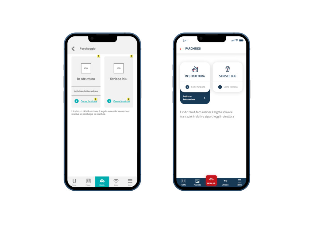
The “Parking” section, for example, has only undergone a redesign of the access screen, while the booking and payment flow have been adapted from the previous version of the app.
Delivery and support
The development of the app was carried out by the UnipolSai Development Unit.
During this phase we collaborated with the Unit providing the complete prototype of the redesigned sections the documentation and the necessary support for the various development and analysis stages.
Deliverable
Information architecture, Axure prototype, Documentation
Software
Axure, Sketch